
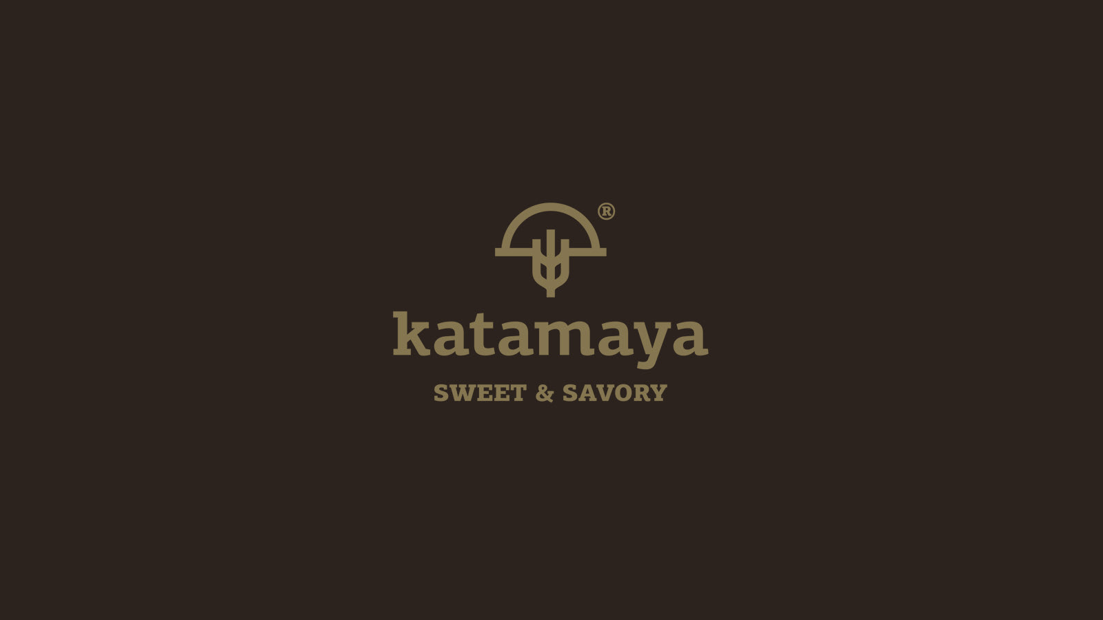
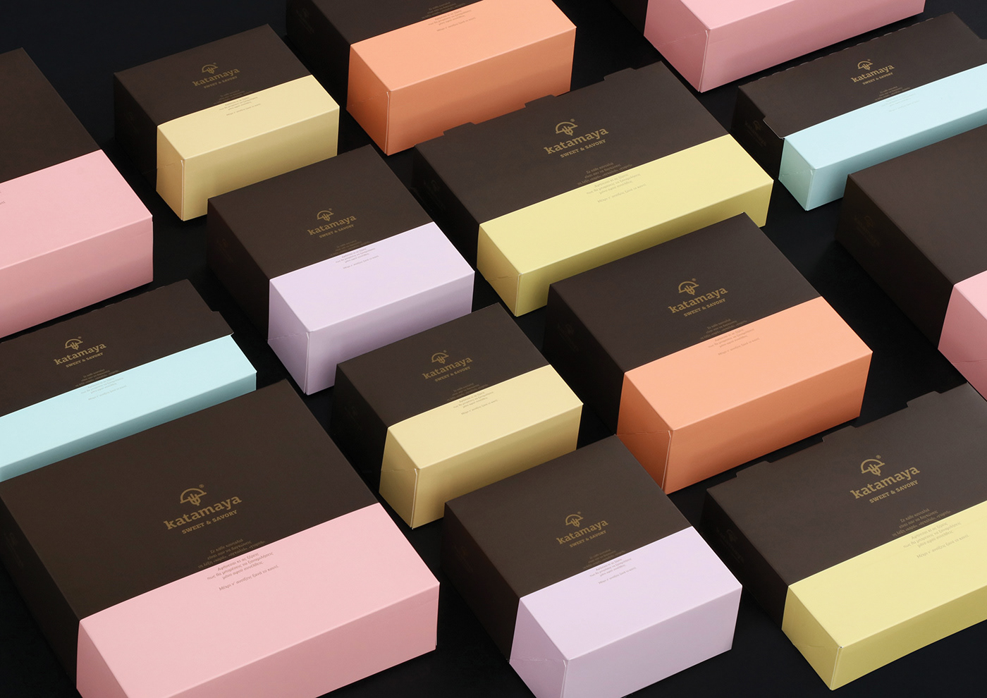
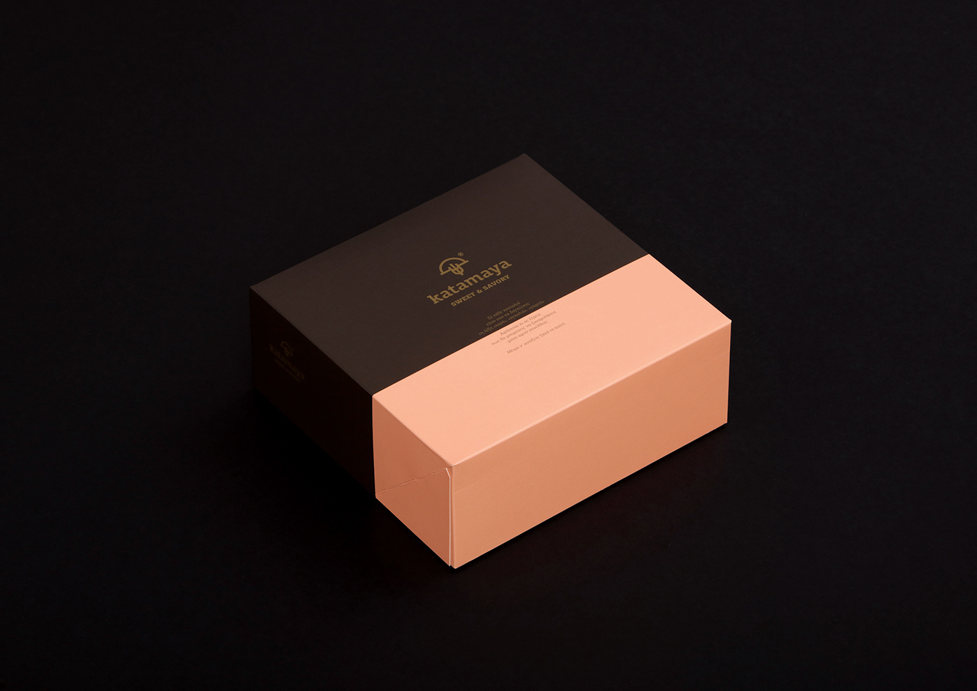
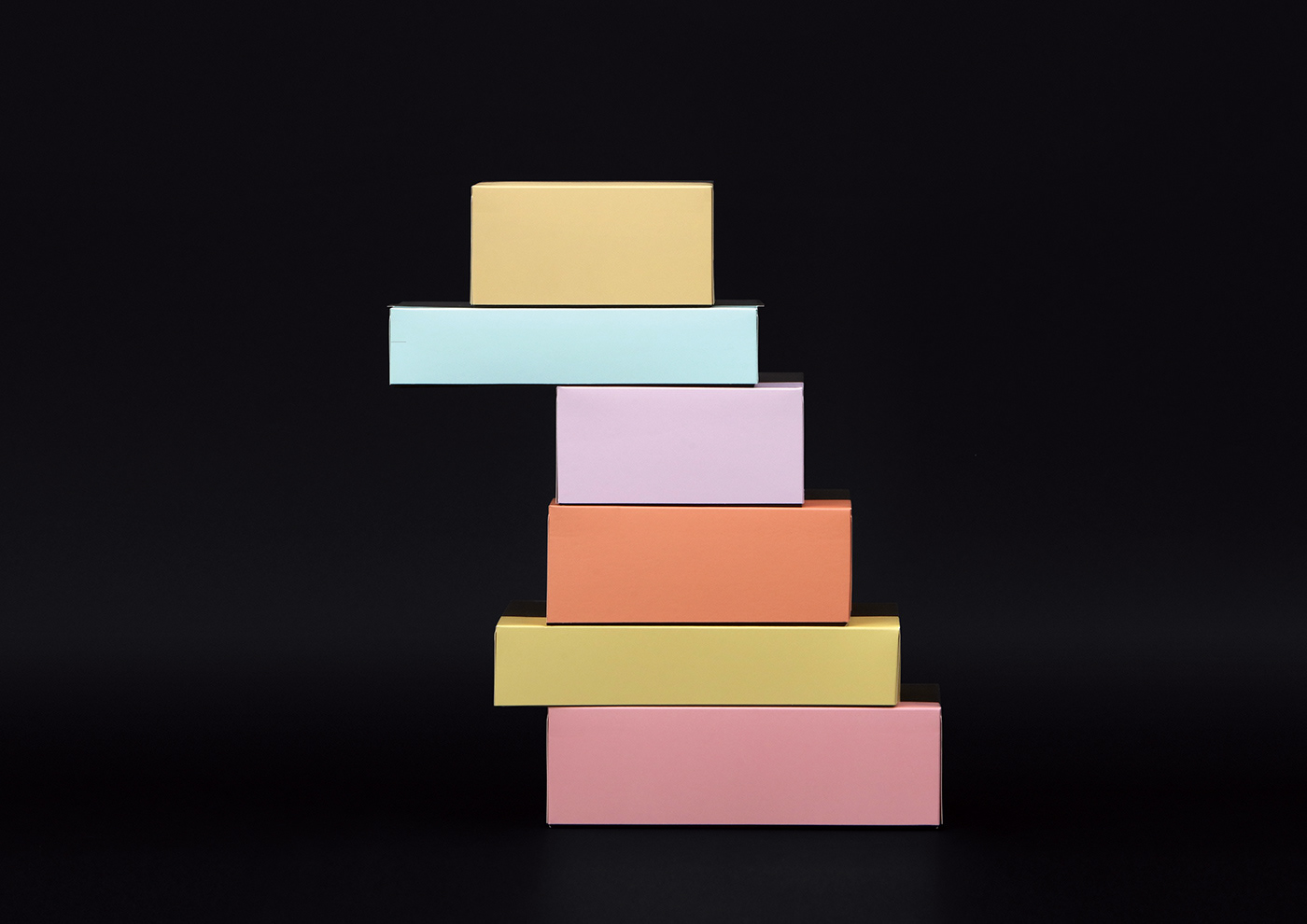
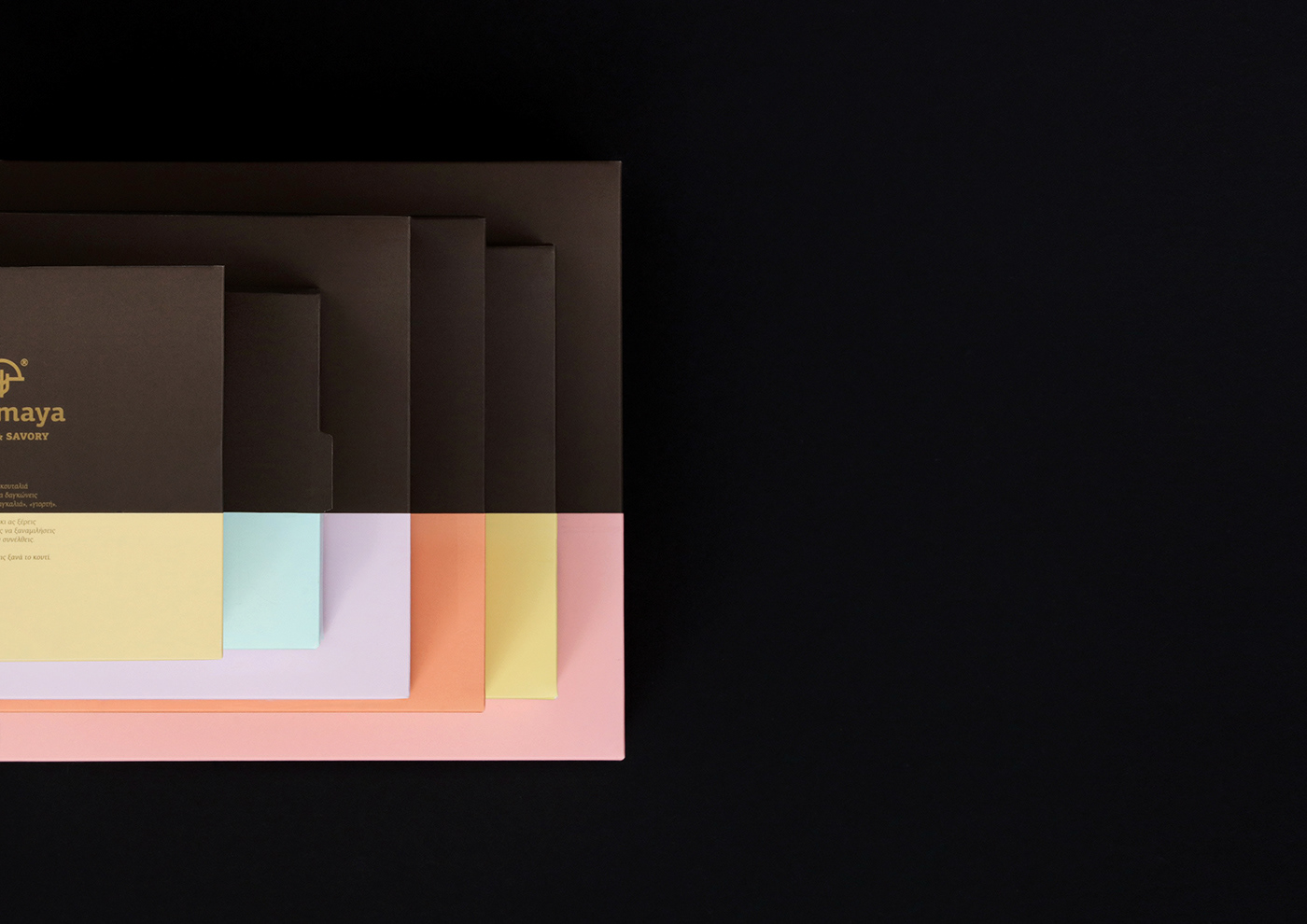
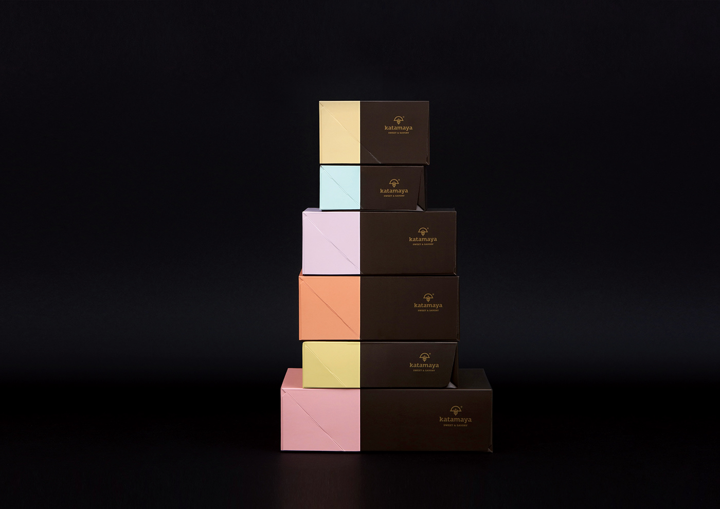
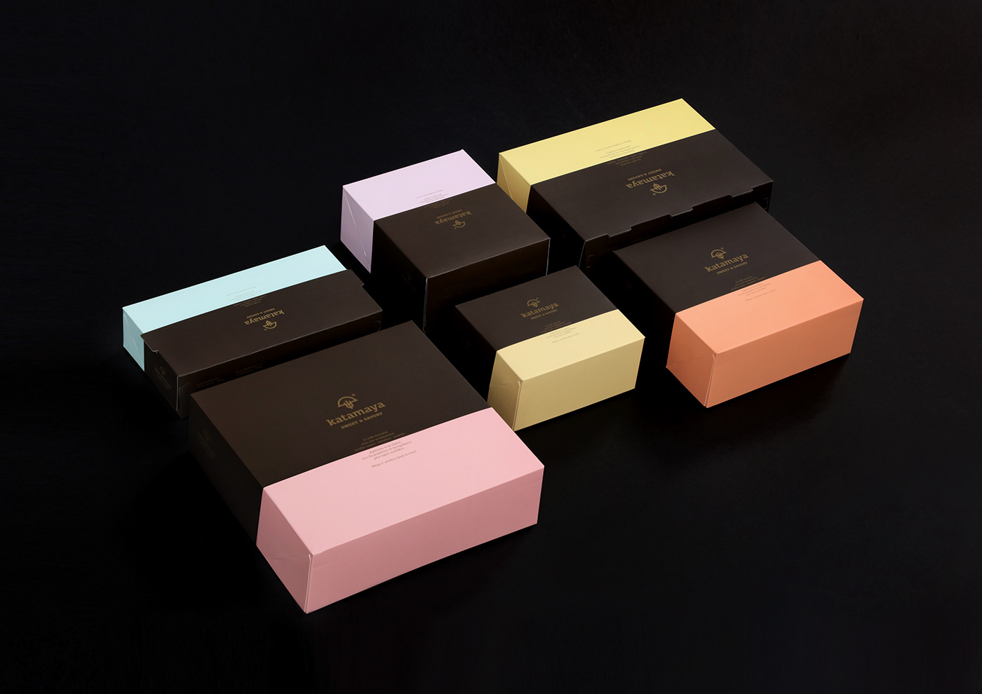
Η μελέτη που έγινε για λογαριασμό της εταιρίας Katamaya sweet & savory είχε σαν σκοπό τη δημιουργία συσκευασιών που θα προϊδεάζουν οπτικά και λεκτικά τον καταναλωτή για την εξαιρετική ποιότητα των ζαχαρωτών και των γλυκισμάτων της.
Για πρωτεύον χρώμα των συσκευασιών επιλέχθηκε το σκούρο καφέ, που παραπέμπει στη σοκολάτα, το οποίο συνδυάστηκε με ένα δεύτερο χρώμα, διαφορετικό σε κάθε συσκευασία, εμπνευσμένο από τις αποχρώσεις των ζαχαρωτών.
Η χρωματική αναλογία στις συσκευασίες έχει αποτυπωθεί κάνοντας χρήση του χρυσού αριθμού ‘φ’, ενισχύοντας έτσι την αίσθηση της αρμονίας και της σημασίας που η εταιρία δίνει στη λεπτομέρεια και την ποιότητα.
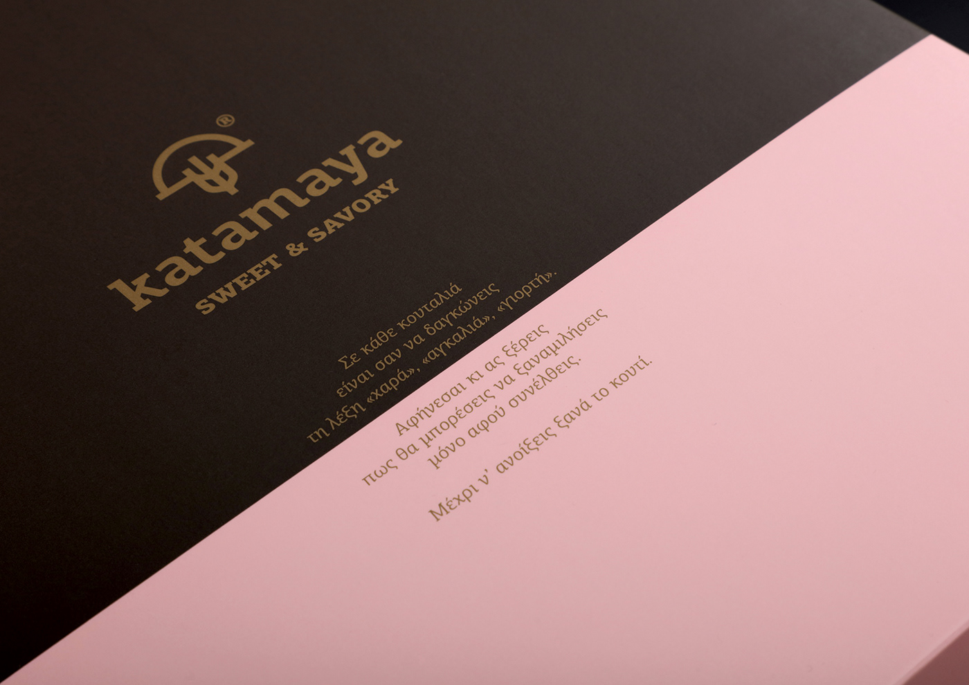
Το κείμενο στην όψη των κουτιών έχει σαν στόχο να προδιαθέσει θετικά για αυτό που θα ακολουθήσει με το άνοιγμά τους.
CLIENT Katamaya | Sweet & Savory
CONCEPT & DESIGN Chris Trivizas
NAMING Harry Tzannis
COPYWRITER Katerina Luisa Esslin, Sissy Caravia
TYPEFACE Parachute® Typefoundry
PHOTOGRAPHY Math Studio
©2018
TYPEFACE Parachute® Typefoundry
PHOTOGRAPHY Math Studio
©2018